It's that time of year again, when I spend way too much time going through mainstream fashion's "it" fall colors. Here's Fall 2017 (If you want to see my post on last year's fall 2016 colors, click here.) Per Pantone's website:
“Bookended by a dynamic Grenadine red and a tawny Autumn Maple, the color palette for Fall 2017 leans more to warmth, “ says Eiseman. “While comforting, enveloping colors and ease are crucial to the seasonal feeling, standout shades include a pale pink Ballet Slipper, a refreshing Golden Lime, and a bright Marina blue. These hues add a striking touch when paired with the classic autumnal shades of Navy Peony, Neutral Gray, Butterrum and Tawny Port.”You forgot mustard, Pantone! But the colors go together pretty well. Many are repeats from previous seasons. I'd pretty much wear all of these, and I see stores carrying all of these colors. I also see a lot of people wearing these colors in real life. They are pleasing together in many combinations, and a lot of these can be used in dark fashion sets. But first, mandatory mainstream fashion spread:
pantone fall 2017 featuring a purple top
Grenadine: Seemed like a lot of runway shows featured this bright red. And I saw a lot of high-fashion dresses on 5th Ave in this color. This is the color if you want to look fancy.
Tawny Port: So the romantic goth look, dead for about a decade or more, is back, floating on ruffles and big flowy sleeves. It's got a modern twist that I love. Check out any fast-fashion and high end store. It's your time to shine, romantic goths, and if Alchemy Gothic isn't exploding with fake garnets right this second, someone check on them because they are dead.
red featuring a flutter-sleeve dress
Ballet Slipper: Fetish goths, you've got your pretty innocent pastel pink.
Butterum: I don't see a whole lot of dark fashion applications for this, but it's a nice shade. A wool coat like the one in the first set will look professional, looking awesome next to the next color...
Navy Peony: If I was still a hairstylist, I'd color someone's hair Butterum and Navy Peony. Chunky highlights. Honestly this color is the color EVERYONE in midtown is wearing. In NYC, this navy color is the it color. I don't know why...though I just bought a work dress in this color too, so I guess it's something in the water.
Neutral Gray: I guess not every color gets a cool name. This could be interpreted as silver jewelry, and is still a desired hair color, if you are lucky enough to be able to get this shade.
Shaded Spruce: When worn with Neutral Gray, you'll literally get the same nu-goth color scheme I did in 2015, reprinted here for your convenience.
biscay desert sage featuring a fox coat
Golden Lime: by the way, where the hell is Pantone's color of the year, Greenery? I guess it's here as Golden Lime. It's a good eyeshadow color or accent color. I think it'll look cool in something textured like fur or velvet.
Marina: Mandatory denim color.
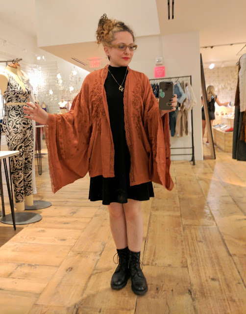
Autumn Maple: My personal color of the season. I lost my mind when I saw this kimono at Free People, and I literally wear this thing every day. Guess I'm going to be wearing halloween colors the entire season...I'm also planning on coloring my hair orange and black (instead of the current blond and brown)
 |
| look at the sleeves on this thing! |
Thoughts on the fall colors?


