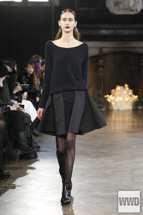
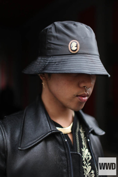
Happy Spring, everyone in the northern hemisphere! It's that time of year. Pantone color time. My personal seasonal challenge: gothing up the season's Pantone colors. I'm not sure why I do this. (Those of you in the southern hemisphere, you can see fall's colors here)

What's Pantone? Well, it's basically the, um... only color company? Everything that uses colors uses Pantone colors. You need something printed at a commercial printer? they're going to ask you for a Pantone color number. Ordering fabric from a textile manufacturer... going to need a pantone color for that too. I don't understand how they make their money.
Spring/summer colors are always a challenge for those of us with darker wardrobes. The above colors are especially a challenge. When I did this for fall 2013 there were actually a few colors I loved: the deep violet-purple Beaujolais, which looks awesome as lipstick; the washed-out, grungy deep lichen green. I thought I was going to hate these spring colors, but I actually like them. This is a great time for rockabilly looks, vintage/antique looks, steampunk, pastel goth, and postapocalyptic fashion.